


Bottom-up done well – Part 2 of 2
Give your consumers a reason to use bottom-up processing—or go off autopilot—when viewing your products on-shelf by creating disruptive packaging design.
By Dr. R. Andrew Hurley
Contributing Editor, Packaging World
The white paperboard milk carton is as top-down as you can get—but NOT in the cereal aisle. When the California milk consortium that brought us the famous “Got Milk?” campaign decided to expand their influence into products that encourage milk consumption, cereal was a sure bet. In the aisle of big, flat rectangles and gusseted flex bags, the iconic gabletop milk-carton shape becomes a great disruptor while reminding you that you do not, in fact, “Got Milk.”


When your whole planogram is dominated by bright, shiny packaging, heading in the opposite direction can be disruptive. Even though I feel generally impervious in a normal grocery store setting, I found myself stopping recently to take a second look at the Buck Wild chips bag.
The matte-black film and package-dominating logo may be the antithesis of textbook design direction, but the bags definitely draw your attention when you’re scanning the chip aisle. And they automatically feel a little more premium. It was just what was needed to drop-kick top-down processing and throw a little bottom-up in your face.
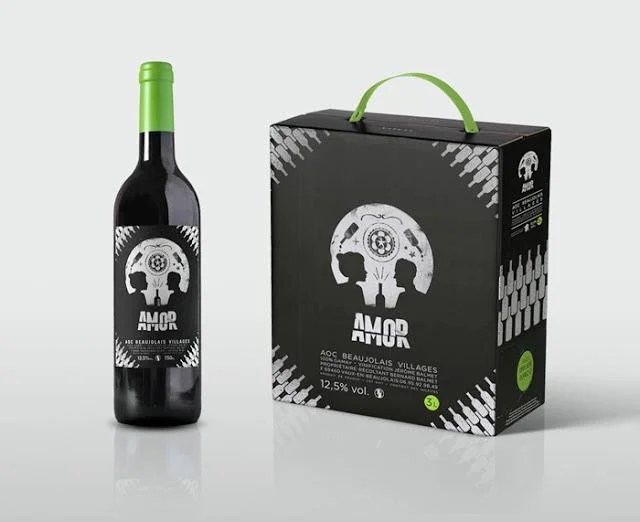
One of the best ways to force bottom-up processing is to construct a visual question: What are you seeing? And to ensure a bottom-up response, make that question impossible to answer. Amor wine’s label and secondary packaging offer shoppers two images simultaneously: the classic Mexican sugar skull and a happy couple enjoying a bottle of wine (or an example of “reversible figure/ground” in Human Factors speak). This visual disconnect is classic—a true disruptor that forces the viewer to consider the two options. The longer someone is entranced by your packaging graphics, the more likely they’ll be to give it a try. And this design glows in the dark. After the zombie apocalypse, this will be the one bottle of wine customers can immediately identify in the darkened grocery store.
To help you navigate these murky waters (and the impending zombie apocalypse), The Packaging School has created an online course on the Human Factors that impact packaging design. Specifically, we discuss over 60 examples like figure/ground relationships, geometric rules, design hierarchy techniques, and 57 more amazing things. It’ll give you insight into how we use our senses to process the information we are bombarded with every day, and some tips and tricks to turn expectations on their ear. We’ll help you incorporate disruption into your packaging design and encourage the bottom-up processing that will make your product jump off the shelf. Check it out for yourself.
Dr. R. Andrew Hurley is Assistant Professor of Packaging Science, Clemson University, and founder of Package InSight and The Packaging School. He can be reached at andrew@packageinsight.com
https://www.packworld.com/article/package-design/strategy/disrupting-shelf-bottom


